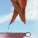
Okay, somebody gave this a score of 1. I don't think it's worth that low. I think it's a 3... To give some pointers:
1. don't center your artwork in the middle.
2. put more content on the edges.
3. Use what you're given to inspire your artwork.
Keep in mind that this is collaborate artwort, not small squares of personal art. You're supposed to "go with the flow" and create artwork together with your neighbourns.
This tile is from For Newbies III: The Resurrection.
Tile Info

Comment:
my first try at this so be fair if its not so good
By: JrB2403
Checked out at: October 23, 2001
Checked in at: October 23, 2001
Checkout tile:
In Context
Posts
hmm...


