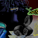
My main beef with this tile is that it appears to be a straight render out of a 3d app with no attempt at blending. If you look at some of the most highly-rated tiles on this site you will notice that for the most part they blend seamlessly with their neighbors. This is not true in this tile. The plain black background fails to mesh with the mottled dark red background you were given in the bottom edge of your original tile. This is highly distracting. The bluish wrist area of your hand (I sincerely hope you modeled it yourself) also fails to mesh with the bluish stairstepped object below it. There is no continuity in form or color, and coninuity is generally what is most important. Also, the rendering itself is of amateurish quality. There is no texturing on the skin of the hand, the balls cast no shadows, and the camera angle is so bizarre as to nearly hide the fact that this is a hand. The black background is uninteresting and cliche.
I suggest that you buy a book on general 3d concepts (lighting, composition, texturing, etc) and also experiment with making faux 3d art in photoshop. It is very rewarding, I've recently discovered.
Andrew
This tile is from Pixel Kebab
Tile Info

Comment:
If you squint it's quite pretty
By: richandsi
Checked out at: July 11, 2001
Checked in at: July 12, 2001
Checkout tile:
In Context
Posts
Blending is very important
Re: Blending is very important
*sigh* and the quilt was going so well until it got to this corner.
Re: Re: Blending is very important
yeh...
it does kinda look pretty when you squint though....
and maybe if u squint hard enough, u won't see the blending problems... :)
it does kinda look pretty when you squint though....
and maybe if u squint hard enough, u won't see the blending problems... :)


