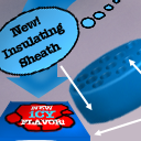
This tile is from I've Got the Blues [Color Theme]
Tile Info

Comment:
the theme made me think of mac and cheese
By: babbleheaven
Checked out at: July 05, 2001
Checked in at: July 05, 2001
Checkout tile:
In Context
Posts
this tile just so doesn't go with the rest of the quilt
I don't see how it fits the theme either
Re: this tile just so doesn't go with the rest of the quilt
watch more tv.
Re: Re: this tile just so doesn't go with the rest of the quilt
There is a world outside America (I assume that's where you are) where they don't show that commercial. Since that's where I live, watching more tv is not going to help.
i know...
you guys were gonna hate this but I had to do it. Blame it on watching too much TV but it just made me think of the Kraft "i've got the blues" mac and cheese commercials.
As for not going with the rest of the quilt, well i did this before most of the tiles showed up. It's free expression baby.....
As for not going with the rest of the quilt, well i did this before most of the tiles showed up. It's free expression baby.....
Re: i know...
No, You really DID NOT have to do it! and i really think the quilt would have been better if you hadn't!
I've only got a couple complaints with this:
The colours are off. while it's no rule that we must adhere to a particular colour .. it does seem to me that would be a good idea in making the whole thing fFlow better!! you are not making a single image surrounded by other single images!! you are making a piece of a giant puzzle!!
The blatant advertisement annoys me. it could be me. but it just seems like we've got this great piece of dark imagery with gothic undertones and deep hues and stuff .. and then there's this big orange dinosaur with a cheesy grin, as it were. ugh. maybe it's just me .. but damn i hate ads. (no, i'm not fFond of other tiles which are large ads fFor products, either..)
lastly, your tile doesnt seem to use any of the elements fFrom any surrounding tiles. i saw the two toned section coming across the panel below yours and thought 'hey, there's gonna be a cool sword! (or not)' but you didnt really use that at all, i dont think. it just terminates and that's that.
Not that i'm any kind of graphic genius. but i really think the whole quilt would have done better without this tile at all.
err, nothing personal .. your work is actually quite good .. i just loathe this one.
Re: i know...
To add another voice to the fray...
I voted low on the tile. I think that the color scheme sort of works okay -- orange is the complement of blue, even if the orange here weighs a little too brightly and heavily. The cartoony look really doesn't fit in with the theme of the quilt, though. And the advertising looks really ugly and incongruous (and no, I won't "watch more TV"... this is what I do *instead* of tv!)
I voted low on the tile. I think that the color scheme sort of works okay -- orange is the complement of blue, even if the orange here weighs a little too brightly and heavily. The cartoony look really doesn't fit in with the theme of the quilt, though. And the advertising looks really ugly and incongruous (and no, I won't "watch more TV"... this is what I do *instead* of tv!)
...
you forgot to read that it was a color-theme... color theme means "generally stick to the same colors"...
Re: ...
there is blue and orange is blues compliment. i guess i interpret the theme too freely.
the second messed up quilt by babbleheaven.
"As for not going with the rest of the quilt, well i did this before most of the tiles showed up. It's free expression baby..... " is NOT an excuse. you should have read the messages posted ! I believe that is why we have THEMES for the quilts... to try to work together not for mess-ups. How come you were able to do the other tile for this quilt to fit the theme??...
Re: messed up messages.
An excuse! it's an explanation....what kind of place is this when you have to defend your work! I think this is a great place to explore but it's hardly welcoming when you feel like you have to defend all of your shit all the time.
If it's such a huge deal then take this tile off . . . this site is getting elitist.
If it's such a huge deal then take this tile off . . . this site is getting elitist.
Re: Re: messed up messages.
I'm pretty new here, but I disagree when you say it's becoming elitist. Your tile is predominately orange, with the big dragon and noodle (or whatever it is). They stand out more than the little blue patch, so it doesn't seem to fit in with the overall theme. It's not the tile in and of itself that the problem lies (I think, anyway) but the colors you chose to use in the tile. I think the intention was for this quilt to be mostly blues, greens, and other "cool" colors, and orange is anything BUT "cool". ;) Again, the tile is fine...better than anything I could do..I can't do jack crap with photoshop or PSP, so probably just about everyone here is better than me. :)
Re: Re: messed up messages.
Not to mention the bright red and yellow... ;)
Re: Re: Re: messed up messages.
i see your point. I guess when I tried to play by the rules I got flack for it (my eskimo blue tile) so I guess I figured why not go against it. My rebelious nature got the better of me. At least you were nice in making your point. It made me see my error more clearly. Thanks.
Re: Re: Re: Re: messed up messages.
see, and i actually like your eskimo. it uses a given colour scheme, it shows something unique, and it seems to work with its surroundings. it's not what i would have expected either. and that's a good thing!
but this tile is *horrible*
but this tile is *horrible*
yeah its YUK!
ummm most of this tile is from scifi but this tile is SOOOO cartoony... its just don't go, want some advice... talk 2 slothy and get rid of it!!!
Pot calling kettle black
Your average score: 1.0
His average score: 1.5222 ..
His average score: 1.5222 ..
I dunno...
I'm not getting my undies in a wad over this tile. The perp had a point in that the wicked orange dino does indeed complement the blue. And I must argue that the other tiles not having shown up /is/ a legitimate excuse, and furthermore his tile is /his/ tile, and is a free expression of his creativity. I cannot agree with criticizing it for being an ad, either, as it's obviously just something the artist thought looked cool. I have serious trouble believing that anyone would blatantly advertise anything (especially macaroni!) on this page. And to those who complain about it not fitting in with the overall 'theme' of the quilt: once again I argue that the only prompt given was "I've got the blues," and that is definitely open to various levels of interpretation.
If this artist is shamed into having slothy remove his tile it will be a tragedy, as the quilt will have lost what might very well turn out to be the single most interesting feature!
And uh also I have the tile above his and already incorporated his Kraft box into my tile.
Andrew
If this artist is shamed into having slothy remove his tile it will be a tragedy, as the quilt will have lost what might very well turn out to be the single most interesting feature!
And uh also I have the tile above his and already incorporated his Kraft box into my tile.
Andrew
Re: I dunno...
-----------------------------------------------
"I think rather than sticking to an actual blue color scheme I think we should try to stick to "cool colors" (mostly blues, but greens and purples are OK).
And to theme this quilt even more, how about trying to make your tiles express moods that are associated with blue (sad, mellow, somber, etc)."
-----------------------------------------------
It was on the front page before tile 1 was submitted. A pretty clear explanation of "I've got the blues" IMHO.
As for free expression, well, it's a themed quilt. In picking a theme, the idea is to stick to it. And yes, that is a restriction on freedom. It's supposed to be. An imposed limit to maintain a consistent feel across all tiles, whether it be a limit to content or color or both. That's what it's there for.
Whether the tile is interesting, unique, an advertisement, whatever is totally irrelevant. It could be the single greatest thing ever created on a computer when viewed on its own and it wouldn't change the fact that it is a disruption to the intended cohesive element of the quilt when placed in context.
Finally...
I'm glad this post wasn't met with more juvenile rants :) You do raise some valid points. Hmm. I'll have to think about it some more :-) But still, if the tile is actually removed, then I would want to remove mine as well because it really does incorporate the kraft box (with new ICY flavor!).
:-/ Hmm oh well.
*Shakes Darkmage's hand*
:-/ Hmm oh well.
*Shakes Darkmage's hand*
Re: Re: I dunno...
Yea,
I second it be left where it is,
and possibly remain as a visual reminder to the rest of the artist's the effect a mismatched tile can have on the rest of the quilt.
I too have done a tile that is adjacent to the orange-Kraft dino, and thus would have to have mine removed as well. Which would kinda suck.
It's up to each artist to do what they think should fit, and some hit, and some miss.
I think the dino should stay, but let this little squabble be a lesson to everyone for future endeavours.
Yep.
Max
this must be...
the biggest post in all of ice.org...
some create art to be provocative... If that was the purpose than the artist here has certainly succeeded... In fact, I'm pretty sure I'm not the only one who believe that art critisism by other artist cut twice as deep.
The chance is big that above artist have been scared away from tiles.ice.org for all times.
Other speculations could include the artist going on a rampage and on purpose destroying other quilts.
What really is needed I believe is some very clear info for each quilt what the theme/color scheme/"rules" are for the quilt. It must be sure that an artist checking out a tile hasn't missed the info for the quilt.
About deleting this tile, I'm sure slothy and/or another admin can take a mature decision.
As for not offending thoe, I think more people would be offended by leaving this tile intact in it's current state than by deleting it. I know I would be less enthusiastic about painting at "I've got the blues" if it remained. (nothing personal!!)
well... that's just my 20 öre...
my last thoughts on this
who knew this was going be such a thing when I created it. sigh. well I'll be cool with whatever "ice" decides. Thanks for all the pointers and interest, even the negative ones. Admittedly I was really pissed when the argument over this first started but after a little time to cool off and read everyone's posts, I'm over it.
I never intended this to be an ad nor a controversy. It was just something that popped up in my head when I read the theme. It was a spoof. "it's the cheesiest" was the title and that was what it was, cheesy.
I've learned a few things from this:
1) I often inadvertently create controversy wherever I go
2) I need to read the themes super carefully
3) The world will have an opinion no matter what you do.
So basically, do your best and suck it up.
Re: my last thoughts on this
Seems like you took it all really mature.
Hope that you will keep on creating tiles...
Hope that you will keep on creating tiles...
Re: my last thoughts on this
Three cheers for babbleheaven. Keep on drawin, (just no more orange dinos with mac cheese...hehe)just kidding... :)
Re: my last thoughts on this
Yay babble :) don't give up!
I wonder if it's a coincidence that three of your four tiles have been adjacent to mine ^_^ hmmmmmmmmm I feel like your tile-brother! Or sister. No, wait. Brother.
I wonder if it's a coincidence that three of your four tiles have been adjacent to mine ^_^ hmmmmmmmmm I feel like your tile-brother! Or sister. No, wait. Brother.
Re: Re: my last thoughts on this
you must be so exasperated with my tiles since you keep having to blend into it :)
Not really
Your tiles have been pretty fun to blend to so far, actually. The kraft box was nice and sharp so there was no challenge there (good), the cloud thing under th eskimo was REALLY HARD to blend to (challenging (good)), and the black chick with the red sash thingie ended up looking awesome cus I learned how to draw cloth and it looks like she has one enormous boob now! Wahou!
Re: Not really
Enormous boobs are definately worth a Wahou! *snicker*
:P
:P
Re: my last thoughts on this
As far as I'm concerned, it's staying. You had fun with it, you took your beating and came out okay, and those who are upset can learn to do the same. This tile does break the theme, but that's why we have the score system. The community has made it clear that they'd rather have it not been created, and I'm sure babbleheaven won't forget it. Tile tile also serves as a reminder to others. In short, it's a win-win situation and let's get back to tiling! Babbleheaven, keep up the hard work. You're appreciated here.
Jon
Jon
not again...
...damn tiles with commercials! you were supposed to be creative. and i don't
believe you weren't able.
believe you weren't able.
iCE
Is it an ad to put iCE in your tile?
Re: iCE
Don't let us have to assimilate you.
Re: Re: iCE
Just to make this thread even bigger... Does iCE still stand for "Insane Creators Enterprise" like it did in the good'ol'days?
Re: Re: Re: iCE
Yes, technically we still stand for that, but it's just as meaningless now as it ever was ;) Plus it helps us a bit to just go by "ice" instead of bragging about that silly acronym, IMHO :)
Jon
Jon
Re: Re: Re: Re: iCE
Why is the "i" in iCE lowercase?
Re: Re: Re: Re: Re: iCE
that is from: intentionally CAPITALIZED ENDING (iCE)
an appropriate quote:
"that's why they've put I in the FBI" - Fox Mulder
an appropriate quote:
"that's why they've put I in the FBI" - Fox Mulder
