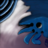
This tile is from Up and Comers
Tile Info

Comment:
Another
By: ugliwork
Checked out at: April 27, 2001
Checked in at: April 27, 2001
Checkout tile:
In Context
Posts
Nice ideas...
and fairly well done, but you left a black line around the edges which makes your quilt hard to blend into breaks up the quilt a lot. Draw all the way to the edge of your tile and try to avoid those black lines.
bad knit
on the right, you didnt really mix the colours very well, i dont think. the goal is to hide seams, not make them more obvious. and while i too have difficulty coming up with subject matter, the fFunny shape could have been stronger.
no offence, really. i just dont think this is a very strong piece.
no offence, really. i just dont think this is a very strong piece.


