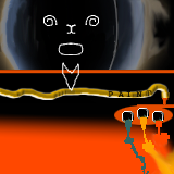
Checkerboards can look nice, and especially so if you apply a few nice effects to them, but they are a ROYAL PAIN to blend up next to.
I did the tile above this one and I think I completely flumoxed up the blending on the checkerboard edge.
If you're going to put checkerboards right up next to your edge, make them evenly spaced by the time they hit the edge. Otherwise, the next person has a royal pain trying to match it.
This tile is from Up and Comers
Tile Info

Comment:
smoke and mirrors
By: manicsuppression
Checked out at: April 08, 2001
Checked in at: April 08, 2001
Checkout tile:
In Context
Posts
Checkerboards may seem like a good idea
Re: Checkerboards may seem like a good idea
My apologies for the checkerboard. I'll throw in an easier to blend pattern next time, but I know what you're saying.. Ive had a pattern or two that were difficult to duplicate
Man, I need a smoke


