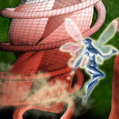
I think the fairy rules - I looks darn good... but I think the background looks abrupt and malplaced...
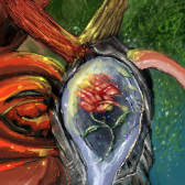
The odd geometric thing (which probably is quite cool as a stand-alone) seems kinda forced into blending with the shapes below...
This tile is from Beauties & Beasts
Tile Info
Comment:
By: glytandrus
Checked out at: October 06, 2002
Checked in at: October 07, 2002
Checkout tile:
In Context
Posts
comment...
Re: comment...
i like the faiy too...
and i think the score was too low...
so i vote 5 to bring it up a bit. ;o)
and i think the score was too low...
so i vote 5 to bring it up a bit. ;o)
Re: Re: comment...
i agree with primal, and the right side of the tile doesnt blend to well. i can see why it had a lower score, not one of ur better tiles. the fairy almost looks rendered, good work on that part!
